


How to Choose the Best Icons for your Project
The best icons are those that are appropriate, memorable, and well-designed. When designing icons for your app, website, or some other project, keep the following in mind.
Make your icons appropriate
Many icons are merely decorative, and thus represent something that is not otherwise obvious in the design. Others represent actions. When a button is clicked, what happens? Is an action initiated? Is something deleted? Is something saved?
Choose memorable icons
The best icons are those that are both appropriate and memorable. Before you draw an icon, ask yourself if it is memorable.
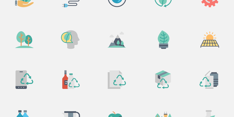
The icons in the following example are memorable because they have clear shapes, and their shapes are strongly tied to the function of the icons.
Make your icons well-designed
There are many different ways to design icons. Some are skeuomorphic (such as the Notes app icon shown below), while others are more simple and abstract. Certain styles work better for certain projects.
In general, the simpler the icon, the more likely it is to fit well in a variety of situations. The more ornate the icon, the more relevant it is to the project that contains it.
Consider icon size
Icon size is relative to other icons in the same view. In the Mail app, the icon for a new message is larger than the icon for a new event, because new messages are more common than new events.
Consider icon color
Icon color is also relative to the app or website that contains it. The Mail app uses blue icons because its background is blue.
Avoid using text labels
Icons should be self-explanatory. If you must label your icons, make the labels as short as possible. The labels in the following example are not short - the labels are as long as the icons!
Use icons only for actions, not objects
If you must use an icon to represent an object, such as a folder, make sure that the icon is clear. The icon in the following example is a folder, but it is not clear.
If you must use an icon to represent an entity, such as an animal or a company, make sure that the icon is clear. The icon in the following example is an entity, but it is not clear.
To Summarize;
The above are 7 important guidelines to design effective Icons for your app. If you follow the above guidelines, your icons will have high usability, high aesthetic, and high recognizability.
For more in-depth detail of the topic, you can read this article on Icons design.

